Chart any metric.
Compare any stock.
Visualize 80+ financial data points across 170,000+ stocks. Compare peers, spot trends, and download publication-ready charts.
80+ Metrics
Income statement, balance sheet, cash flow, and ratios. Pick exactly what matters to your thesis.
Side-by-Side Comparison
Overlay the same metric across multiple stocks. See who's growing faster at a glance.
Built-in Stats
Every chart surfaces CAGR, averages, highs, and lows. No spreadsheet formulas needed.
Recommended Metrics
Stock Unlock highlights the best metrics for each stock. Look for the star when you pick what to chart.
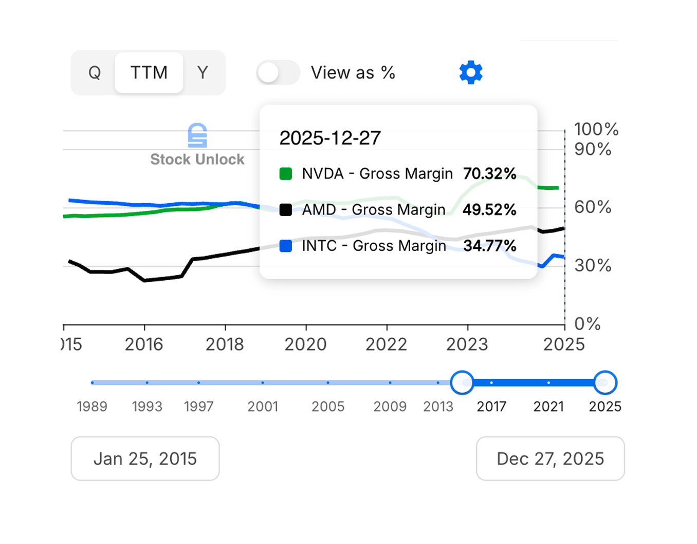
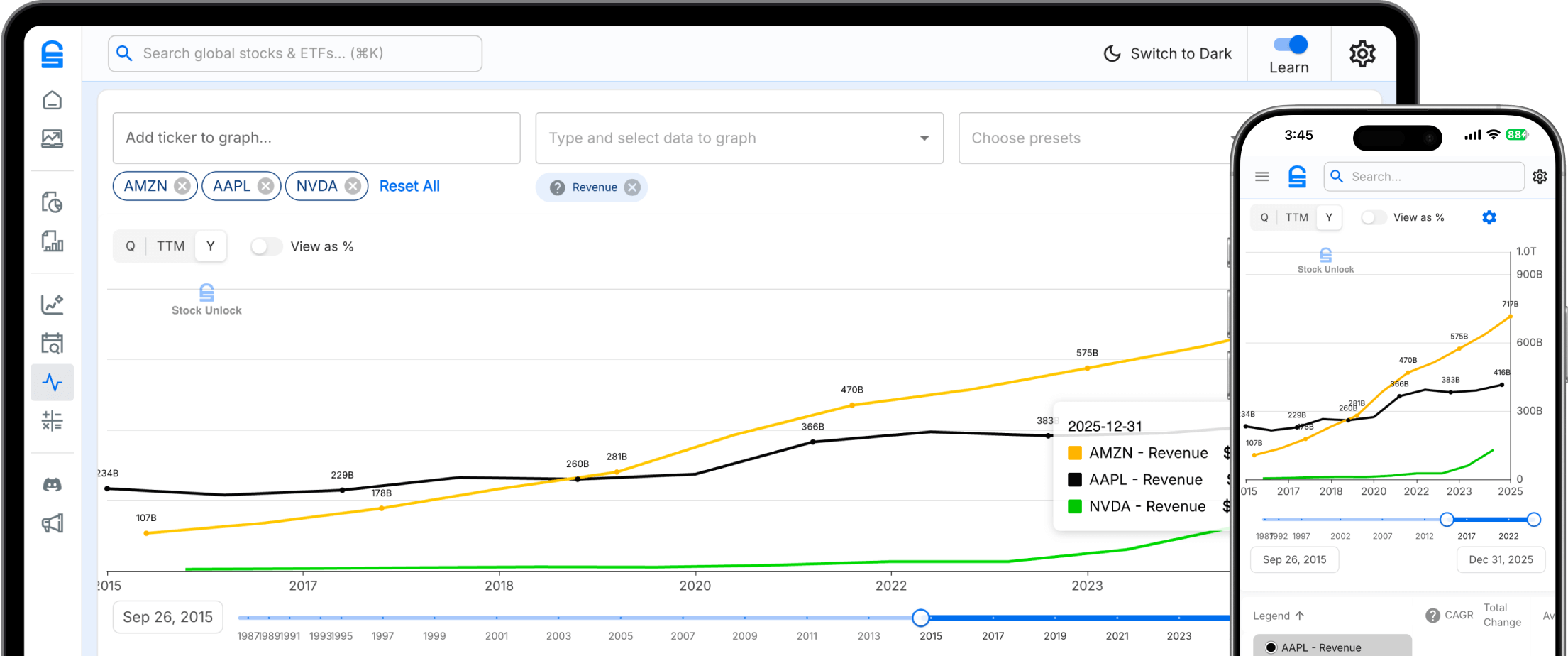
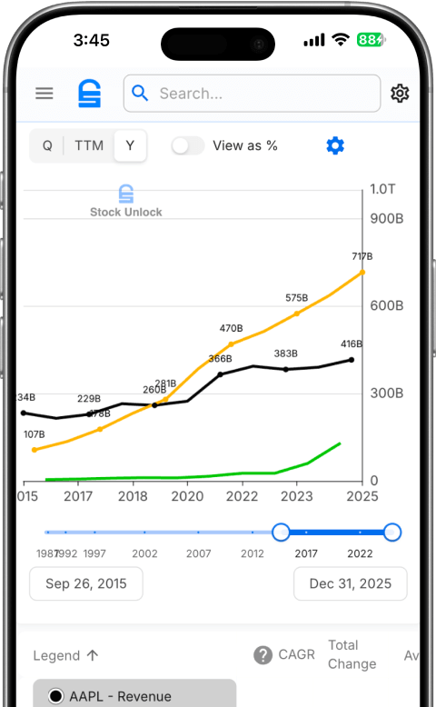
Put competitors head to head
Add any tickers and compare the same metric across companies. Instantly see who's growing faster, spending more, or generating more cash.
- Overlay multiple stocks on one chart
- Toggle "View as %" to normalize different-sized companies
- Adjustable date range with timeline slider
See the full picture for any stock
Chart multiple metrics for a single company on one screen. Plot revenue alongside net income, or stack free cash flow against capex to see how efficiently a business converts growth into cash.
Try Stock Comparison
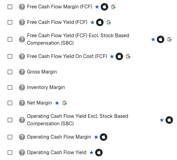
Know what to chart before you compare
With 80+ metrics to choose from, it's easy to chart the wrong thing. Stock Unlock highlights where to start in the metric picker.
- Blue star marks recommended metrics
- Ticker logos show which companies recommend each metric
Every number that matters
Choose from metrics spanning every financial statement.
Income Statement
Balance Sheet
Cash Flow
Margins & Dividends
Frequently Asked Questions
Everything you need to know about Stock Unlock's Stock Comparison Tool
What is Stock Unlock's stock comparison tool?
Stock Unlock's stock comparison tool lets you chart and compare financial metrics across any of our 170,000+ stocks and ETFs. You can overlay the same metric (like revenue or free cash flow) across multiple companies to see who's growing faster, or chart multiple metrics for a single stock to understand the full picture.
Every chart automatically surfaces key statistics including CAGR, averages, highs, and lows. You can toggle between absolute values and percentages to normalize companies of different sizes, adjust date ranges with a timeline slider, and save custom setups as reusable presets.
How many financial metrics can I compare?
You can compare 80+ financial metrics spanning income statement, balance sheet, cash flow, and ratios. Income statement metrics include revenue, net income, EBITDA, EPS, gross profit, operating income, and more. Balance sheet metrics cover total assets, total debt, book value, cash and equivalents, enterprise value, and 20+ others.
Cash flow metrics include free cash flow, operating cash flow, capex, dividends paid, and stock-based compensation. You also get margins and ratios like gross margin, net margin, FCF yield, dividend yield, payout ratio, and many more.
Can I compare stocks from different countries or exchanges?
Yes. Stock Unlock covers 170,000+ stocks and ETFs across 70+ global exchanges, and you can compare any of them side by side. Chart revenue growth for a US tech stock against a European competitor, or compare dividend yields across companies listed on NYSE, TSX, LSE, Frankfurt, Tokyo, and dozens of other exchanges.
All financial data is standardized according to GAAP standards, so metrics are consistent and comparable regardless of where a company is listed. Currency differences are handled automatically, letting you focus on the fundamentals rather than exchange rate math.
What's the difference between multi-stock and multi-metric views?
Multi-stock mode lets you pick one financial metric (like revenue or free cash flow) and overlay it across multiple companies on the same chart. This is ideal for peer comparisons, letting you instantly see which company is growing faster, has higher margins, or generates more cash flow.
Multi-metric mode flips it around: you pick one stock and chart multiple metrics together. This helps you understand the full picture of a single company, for example charting revenue alongside net income and free cash flow to see how efficiently a company converts sales into profit and cash.
How far back does the historical data go?
Unlimited plan subscribers get access to up to 35 years of historical financial data, while Pro plan subscribers get up to 10 years. You can view data in quarterly, yearly, or trailing twelve month (TTM) formats, and use the timeline slider to zoom into any date range you want.
Every chart automatically calculates key statistics including CAGR (compound annual growth rate), averages, highs, and lows for the selected time period. This makes it easy to spot long-term trends and compare growth rates across companies without doing the math yourself.
Can I save my comparison setups?
Yes. You can save any combination of stocks, metrics, date ranges, and display settings as a reusable preset. This means you can set up your favorite comparison once and come back to it anytime without reconfiguring everything from scratch.
Presets are saved to your account, so they sync across devices. Whether you're checking your comparisons on desktop at home or on your phone during lunch, your saved setups are always available.
Is the stock comparison tool free?
You can access the stock comparison tool for free with a Stock Unlock account. Free accounts can chart metrics and compare stocks with some limitations on historical data depth. Pro subscribers get up to 10 years of data, and Unlimited subscribers get up to 35 years.
All plans include the core charting functionality, percentage toggle, and built-in statistics. Paid plans add deeper historical data, more saved presets, and access to premium metrics. All paid plans come with a 30-day money-back guarantee.
What financial statement metrics are available?
You can chart metrics from across the full range of financial statements. Income statement metrics include revenue, net income, EBITDA, EPS, gross profit, operating income, R&D expense, and more. Balance sheet metrics cover total assets, total debt, book value, cash and equivalents, shareholders' equity, and 20+ others.
Cash flow metrics include free cash flow, operating cash flow, capital expenditures, dividends paid, and stock-based compensation. You also get profitability ratios (gross margin, net margin, ROE, ROA), valuation ratios (P/E, P/S, P/B, EV/EBITDA), and dividend metrics (yield, payout ratio, growth rate). Data is available in quarterly, yearly, and trailing twelve month (TTM) formats.
How do I normalize companies of different sizes for comparison?
Use the percentage toggle to switch any chart from absolute values to percentage changes. This normalizes companies of wildly different sizes, so you can meaningfully compare revenue growth at Apple versus a small-cap company without the raw dollar amounts making the chart unreadable.
Need even more control? Assign metrics to separate Y-axes so two completely different scales sit side by side on the same chart. Compare a company's stock price against its earnings per share, or overlay revenue and margins without one flattening the other.
You can also compare margin and ratio metrics (like gross margin, ROE, or P/E ratio) which are inherently normalized. The built-in CAGR calculations let you compare growth rates directly, regardless of company size.
Why is this sometimes called "Free Form" in the app?
"Free Form" is the internal product name you'll see in the Stock Unlock app. We call the feature "Stock Comparison" here because that's what it actually does: it lets you freely chart and compare any financial metric across any stock. Think of it as a free-form charting canvas where you pick the stocks, pick the metrics, and visualize whatever you want.
Whether you search for "Stock Comparison" or "Free Form" in the app, you'll end up in the same place. The tool gives you complete flexibility to build any comparison you need.
Still have questions?